Creating a Simple Fashion e-Commerce App
This has risen to become one of the most popular online shopping sites in the UAE. Noon.com Fashion and Electronics is the leading fashion retailer in the middle east and gulf region. While the sales of these brands inside malls and offline stores have been growing year or year, the sales from online channels (Eg noon.com) have been on the decline. It is principal because customers do not get to try the products before purchase (to check the fabric, the fit, and the overall look) and hence are reluctant to buy stuff online.
The Problem
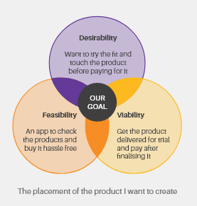
NOON has decided to build a new and independent fashion e-commerce app. This app shows a limited customer set of products (approx. 500), but the key differentiator is that customers can get these products on the same day for trial (less than 2 hours). The customer has to just pay a nominal fee of 8 AED per product as a trial fee (Which has to be paid upfront. Cash on Delivery is not allowed for trial fee payment). Once delivered, the customer can try all the clothes ordered, and decide to buy or reject each product. The customer will have 30 minutes to try all the products while the delivery guy waits. In case the customer chooses to buy a product (let’s assume the selling price is 100 AED), the trial fee is waived off and adjusted to the cost of the product. The customer can then pay the changed amount (AED 93) online on the app or via cash to the delivery guy. The rejected items will return to the delivery guy.

To begin with, I needed to build my case. One does not simply start making a product. It’s critical to get all these insights before embarking on the design itself to ensure that the team is solving the right problems and aligned with the project goals.

The flowchart below outlines the core stages of my redesign process. I chose to take an iterative approach, testing, and improving the design throughout.

A bit more details…
Discover — How do users shop online and in-store?
To thoroughly investigate the problem space of online shopping, I conducted observations in stores and online for fashion brands and other competitors. And then I conducted interviews based on topic maps. Next, I coded users’ responses by looking for commonalities in the challenges users faced and their contexts.
What people love in store
- First-hand experience with the product (touch and see)
- Staff accessible when needed
- The environment made room for people to explore and be inspired
What people love online
- Can look at lots of items quickly
- Save items to list
- Able to check product details and availability online
Understanding User
My principle is “Start With Why” to clearly understand why users would need this app. Why should they care? It establishes the context and can help identify the problem users are facing.
We ask why to find purpose. It guides the narrative and defines the value proposition.
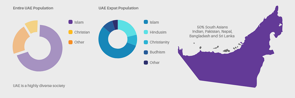
When designing for international markets, having a more international sample often reveals problems that could well exist for domestic users, too. We found that there were no distinct differences between cultures when it comes to main usability issues such as navigation. It resonates with this finding by Jacob Nielsen:
“People are the same the world over, and all the usability guidelines remain the same. After all, usability guidelines are derived from the principles of human computer interaction (HCI), which are founded on the characteristics of computers and the human brain and the many ways the two differ.”
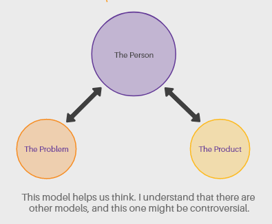
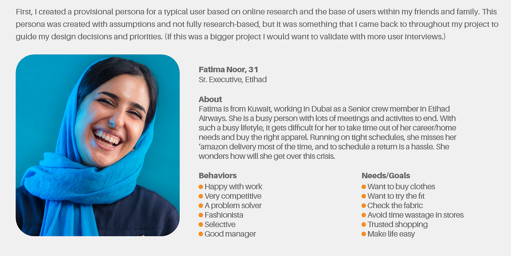
User Persona
Job Stories
I used the Jobs To Be Done framework to explore a context in which a user would use it and understand their motivation and desired outcome.
It culminated in artifacts called Job Stories:

Usability Tests + User Interview
I opted to further validate my assumptions by usability testing and interviewing a comparative demographic: millennials, online shoppers who are users of Amazon, Zara, Myntra, H&M, etc.
Assumption #1
A significant portion of users who reach the home screen has the intention of buying specific items
Findings:
Answers collected to support the assumption that there is a significant portion of users who shop online only when they have purchase intent for a specific item(s):

Assumption #2
Users with specific items in mind look forward to having the option to try the fit and fabric as well
Findings:

Assumption #3
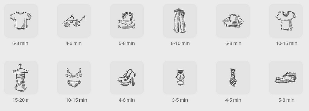
Time is taken to try apparel by a user (as discussed by a group of 10 females)
Findings:
User’s time requirement to try an outfit varies with the item, and if they are trying to create a match
Assumption #4
A significant portion of users are willing to pay for the products they order to try and later buy it
Findings:
I asked users if they are willing to pay for this service per product, to which most of them agreed — however, the behavior was a bit confusing.

Defining Pain Points
People want to be able to quickly decide on an outfit without compromising their creativity and sense of self. Statement pieces reflect personality. Individuals who have statement pieces, tie their identity with their outfits.
Pain Point 1
Making a collection of products based on availability for a home test fit. Assuming not all the products will be eligible. For a brand selling all kinds of lifestyle products, the possibility of having products that are not eligible for test fit is quite high.
Pain Point 2
Making a single Order Id for both: products for test fit & products purchased instantly; e.g. the user has already purchased socks but wants to try out shoes
Pain Point 3
Identifying the time required to try the products ordered for fit — if it is feasible and find a solution. Based on Assumption 3, the time will vary as per the order type — 3 t-shirts will take as much time as a Dress.
Pain Point 4
Tracking the entire order, time calculation, and successful purchase/return of products. Clarity in logistic-ops is a must
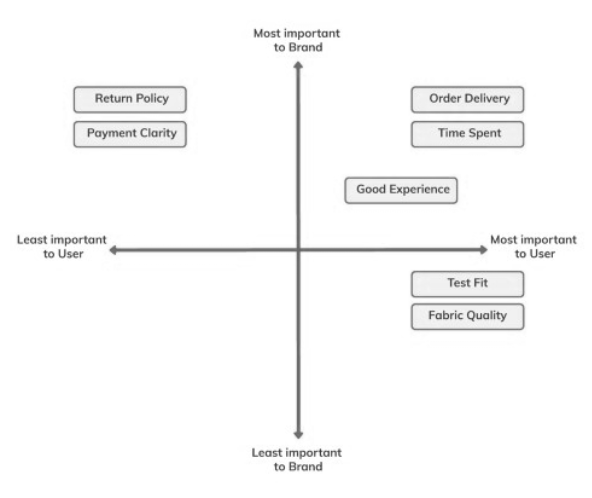
To help prioritize the issues, I used a 2×2 map to help rank the category of issues by how important they are to the business (x-axis) and the users (y-axis).
Usability Tests + User Interview
I opted to further validate my assumptions by usability testing and interviewing a comparative demographic: millennials, online shoppers who are users of Amazon, Zara, Myntra, H&M, etc.
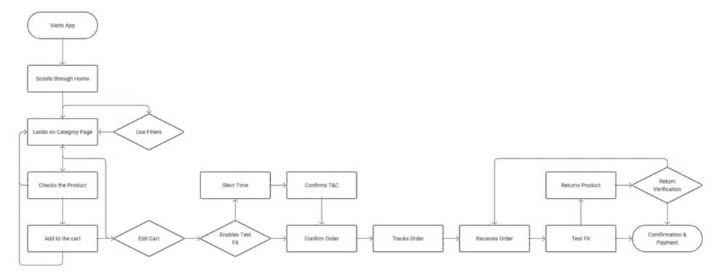
I had to keep in mind the multiple use cases where the user will just buy/test-fit or both, and also the time & fee adjustment accordingly.
What I felt is to play with toggle buttons for the Test Fit feature, and not to disrupt the Law of Similarity

UI — Making the product scalable for Arabic
Knowing that the product is targeted both for Arabic and non-Arabic, I had to make it scalable for two design versions: an English and an Arabic one. Of course, I first designed the English version, which can adapt to the Arabic UI by mirroring the design right-to-left (RTL). But when you’re designing specifically for Arab users, it’s not enough to just mirror the design. There are some local-specific usability considerations to apply.

Copy and type:
Using screen real estate smartly: Arabic is a “wordier” language; therefore, it might take up more space. I had to keep this in mind when designing the layout and UI element pixel size
Paying attention to legibility: Arabic characters are very complex; they have overhanging and looping features. The type needs to be at least four points larger than the corresponding English type to achieve the same degree of legibility. Also had to avoid bold and italics for the same reason.
Reading pattern:
Mirrored F-shape: Arabic-speaking users mirror the F-shaped reading behavior, so had to put the most relevant information on top, as many left-to-right (LTR) sites do.
Mirroring icons: Even in RTL websites, certain icons and logos should retain their LTR alignment, such as:
Icons that indicate direction: e.g. play or rewind buttons on media players, progress indicators, and a clock’s hands should always rotate clockwise too;
Icons that represent objects usually held with the right hand (e.g. phone icon);
Any words are written in other languages and Hindu-Arabic numerals (1,2,3, etc.);
Icons with user expectations: consider whether there is a user expectation for the icon to look a certain way. Also, changing the icon’s alignment would change its meaning.
Images: had to make sure that the images are culturally appropriate for target users

Since it was just a task — I just did the English version keeping in mind the product need to be scalable for an Arabic version when required.

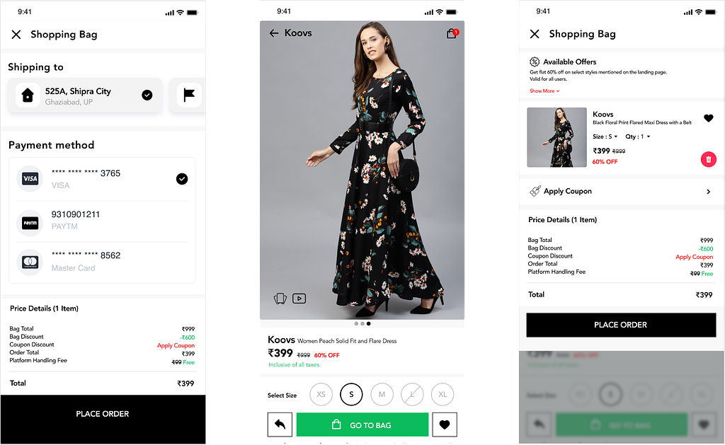
A solution to keep both — the normal and Test fit products in a single card as discussed in the pain points, hence the toggle button will help me identify the product and its further lifecycle.
In case there is no product for a test fit, the user will simply proceed with the regular checkout
Selecting the timing is very critical since the task mentioned the delivery to be in hours — I am not using the date selection here, assuming it is for the same day.
Terms & Conditions are very critical here:
Based on Assumptions, the following things are to keep in mind
The user can try X number of products in Y time. This has been researched. Based on product selected, if the time calculations exceed Y time, a further selection of products to be denied
In case we want to exceed time Y to Y1, the price of the product selected should increase; this is to ward off any constraint on demand & supply line. The price can go from AED3.00 to AED 4.00 if the time 30 minutes exceeds to 45 minutes
A limitation on products for test fit is must — based on previous research, no more than 3 dresses, or 6 t shirts etc can be selected for test fit. This data will come from more research
Safekeeping of product packaging — all tags and packaging must be kept as is it in case of a return, otherwise, a penalty is to be charged.
The user can edit its information before confirming the order
The user can easily track the order on the map; in case there is no in-app navigation — a button to navigate it to maps is there. Once the order is received, in other countries — I might have gone with a confirmation OTP, however not for the markets of the Middle East.
Upon a successful trial, the user can simply use the toggle to accept or reject the product.
The final price payable will be calculated accordingly — and based on that the user will proceed to the payment page or give cash on delivery.
Further…
While working on this, there are multiple scenarios that came to my mind, but, since they were not part of the task — I had to ignore them.
Why not a 3d Try on for fashion accessories?
The time of test fit will vary with age and gender as well — how will we quantify this information?
Doing a case study brings so many thoughts to me, always. It is why I’d love to share my new findings with you guys. However, the solution in the actual project will vary a lot in terms of the data we get from each version of the iteration and testing.

Ecommerce App For Gulf Country: UI/UX Case Study was originally published in Chatbots Life on Medium, where people are continuing the conversation by highlighting and responding to this story.