In this post, I am going to talk about the different metrics that we can use to measure classifier performance when we are dealing with unbalanced data.
Before defining any metric let’s talk a little bit about what an unbalanced dataset is, and the problems we might face when dealing with this kind of data. In Machine Learning, when we talk about data balance we are referring to the number of instances among the different classes in our dataset, there are two cases.
Balanced data
When it comes to the distribution of classes in a dataset there could be several scenarios depending on the proportion of instances in each class. Let’s look an example using a binary dataset.
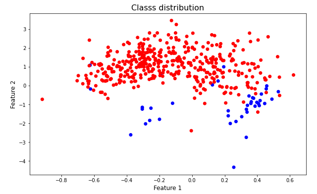
The figure above illustrates the feature distribution of two different classes, As it can be observed instances belonging to the red class is more frequent than the blue class. The class more frequent is called majority class while the class with less samples is called the minority class.
The last plot is an example of an unbalanced dataset, as we can see the class distribution is not the same for all classes. If the data distribution among classes were similar the dataset would be a balanced dataset, the following up image shows this case.
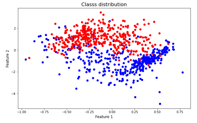
In this case, the scatter chart above shows the data distribution of two classes, in this scenario the amount of instances for each class is similar.
Problems with un balanced data.
We always want to work with perfect data, that is, working with balanced datasets. There are several problems when dealing with unbalanced datasets, when it comes to modeling the most significant might be the bias problem. In this case, since there are more instances belonging to one of the classes the model will tend to bias its predictions towards the majority class.
Another issue that arises when we are dealing with unbalanced data refers to the metrics we are using to measure model performance. And this is the main problem this post is going to tackle.
To good to be true
When it comes to unbalanced datasets we should be really careful about metric choosing and interpretation. For example, let’s say that we have a dataset with 90 instances belonging to one class and 10 to the other one. If we have a classifier that always has the same output, let’s say the majority class we are going to get an accuracy of 90 % which many might think is something great, but the reality shows that the model is unable to distinguish between the two classes, the main task of any classifier.
Evaluating classification models. Accuracy, Precision and Recall.
We can use several metrics to measure performance, such as Precision and recall. In the link above there is a post related to this metrics. One of the limitations of those metrics is that they use one single value for threshold, so the information that they provide is restricted.
Thresholds and classifiers.
When we look at the output of classifiers we usually see a discrete output. however, many classifiers are capable of showing the probabilities instead. For example, in scikit-learn this method is usually called predict_proba it allows us to get the probabilities of all classes.
By default, the threshold is usually 0.5 and is tempting to always choose this value, however, thresholds are problem dependent and we have to think what would be the best option for every case.
Using charts for model comparison.
We already talked about the importance of choosing the right threshold for each problem, to do so it is common to use some charts, in this case I am going to walk through two of them, the precision recall (PR) curve and Receiver Operating Characteristic (ROC) Curve.
The ROC curve shows the variation of true positive and false positive rate for different thresholds. We can use this plot to compare different models. Let’s take a look to the following up example.
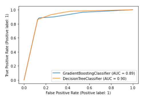
The chart above shows the ROC curve for two different models. The x axis show the False positive rate while the Y-axis shows the True positive rate, in this case we can see how the DecisionTreeClassifier seems to be slightly better than the GradienBoostingClassifier since the rate of True Positive is higher than the True Positive rate gotten by GradientBoostingClassifier. However, in this case, both algorithm are quite good and there is not to much information to extract from this plot.
Precision Recall Curve
We can use the PR Curve to get in at glance much more information about the model, the following chart shows the PR curve for the models beforementioned.
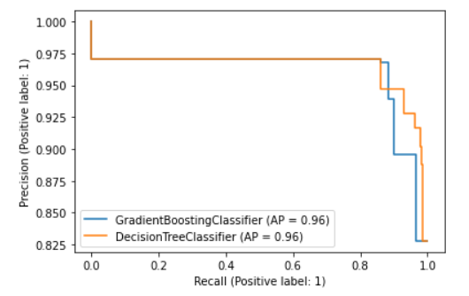
The PR curve shows the variation of Recall and Precision through different threshold values. The chart above illustrates the PR curve for two classifiers, in this case, what we are looking at is the precision and recall values, which allows us to make a better comparison. We can observe that the PR curve remains similar for both classifiers for most thresholds and just after the 0.8 value of recall both curves suddenly drop to a minimum of 0.825 in precision.
Context matters.
Now, to choose the right model we have to take into consideration the use case, or the problem case. In a problem where it is important to keep the number of false negatives low (high recall), it might be convenient to choose the Decision Tree Classifier rather than the Gradient Boosting Classifier.
Although the last chart does not allow to make a more realistic comparison, the main idea is to always take into consideration the application of the model. If we want to distinguish between malignant and benign tumors it will be always more convenient to have high recall (low false negatives) since we do not want to diagnose a malignant tumor as benign. In this particular case, this error can put patients’ lives at risk.
Unbalanced data and problem definition
It is important to notice that the last graphic is showing precision and recall values for different threshold values, this is excellent to measure models trained on unbalanced data. Precision and Recall metrics can be seen directly on the graph, thus evaluating the false negative and false positive ratios at a glance.
However, there is one important point to take into consideration, defining the positive class, The metrics that we went through are based on the definition of a Positive class an a Negative class. Let’s go through this classic example once again. Let’s imagine an experiment where we have 100 samples, and let’s say that 90 samples correspond to the class Benign and 10 samples Malignant. There is an imaginary classifier, and in this case let’s say that our positive class are the benign tumors. After training the classifier we get something like this.
TP = 80, TN=0, FP=15, FN=5
Recall = 0.94
Precision = 0.84
As we mentioned before, for this particular case, in which we need to distinguish between malignant and benign tumors, it is important to get a high recall, however, that is true just because we are interested on identifying malignant tumors.
In the last example, we defined as positive class the majority class, thus is tricky to use these metrics to measure performance, since we are having a high number of True Positive only with the problem definition. The numbers have shown that the model is uncapable of detecting malignant tumors (the negative class) since we are getting a true negative ratio equal to zero. The main take away in this case is that clarity in problem definition is paramount.
If you want to keep in contact with me and know more about this type of content, I invite you to follow me on Medium and check my profile on LinkedIn. You also can subscribe to my blog and receive updates every time I create new content.
References
Model Performance and Problem Definition when dealing with Unbalanced Data. was originally published in Chatbots Life on Medium, where people are continuing the conversation by highlighting and responding to this story.