Case study: tracking app
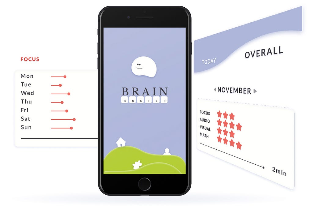
Usage of the Design Thinking Methodology and data visualization in the сreation of a new native mobile application for brain activity training from top to bottom.
Brief
Based on user research, to identify an opportunity for an app to improve people’s day-to-day lives with only requirement that it tracks something.
Which features/functionalities to include is open for proposals from the designer.
As this is a MVP (Minimum Viable Product), the app should not try to solve all of the user’s problems at the same time.
For the purpose of this project focusing on the main user flow that will be the defining factor of the user experience, and not worry about: Login, Sign-up, Account/User Management.
Tools: Figma, Google forms, Maze, paper, marker
Duration: 10 days
Team: 2 persons
Challenge
Since the scope of the project was to design an app that improves people’s daily lives together with my colleague we decided to go deeper and create an app that trains brain activities, tracks data and is inclusive also for seniors.
Research
We started with desk research and gathered general data about senior users and their digital preferences.
NN Group uses a simple definition for “Senior Citizen”: seniors are users aged 65 years or older.
In many wealthy countries, people aged over 65 are the fastest growing demographic. As a global society we are living longer and remaining active later in life.
According to a study conducted by the Pew Research Institute, in 2019 73% of people over the age of 65 were connected to the internet. The US Census Bureau reports that people over the age of 65 have the highest household wealth of any age group.
In 2050, almost every second German will be over 60 years old.
Trending Bot Articles:
4. How intelligent and automated conversational systems are driving B2C revenue and growth.
Here we can clearly see how important this specific audience is and they have special requirements for websites because they have different physical requirements and different experience in dealing with the medium of the Internet.
Research from University of Manchester shows senior users most common preferences. We decided to focused on some of them:
- Use animations sparingly; no dynamic, expandable menus; texts shouldn’t move; no deep information architecture with many hierarchy levels
- Offer larger targets for control elements; easily legible, sans serif fonts in font size 12 to 14 and no fancy fonts; structure in clear and large headings
- Clear contrasts, no changes in the background colors and no use pure white as a background
- Use clear and understandable language; don’t offer unimportant information
Problem Statement and User Persona
How might we help senior people to be included and engaged in brain training app?
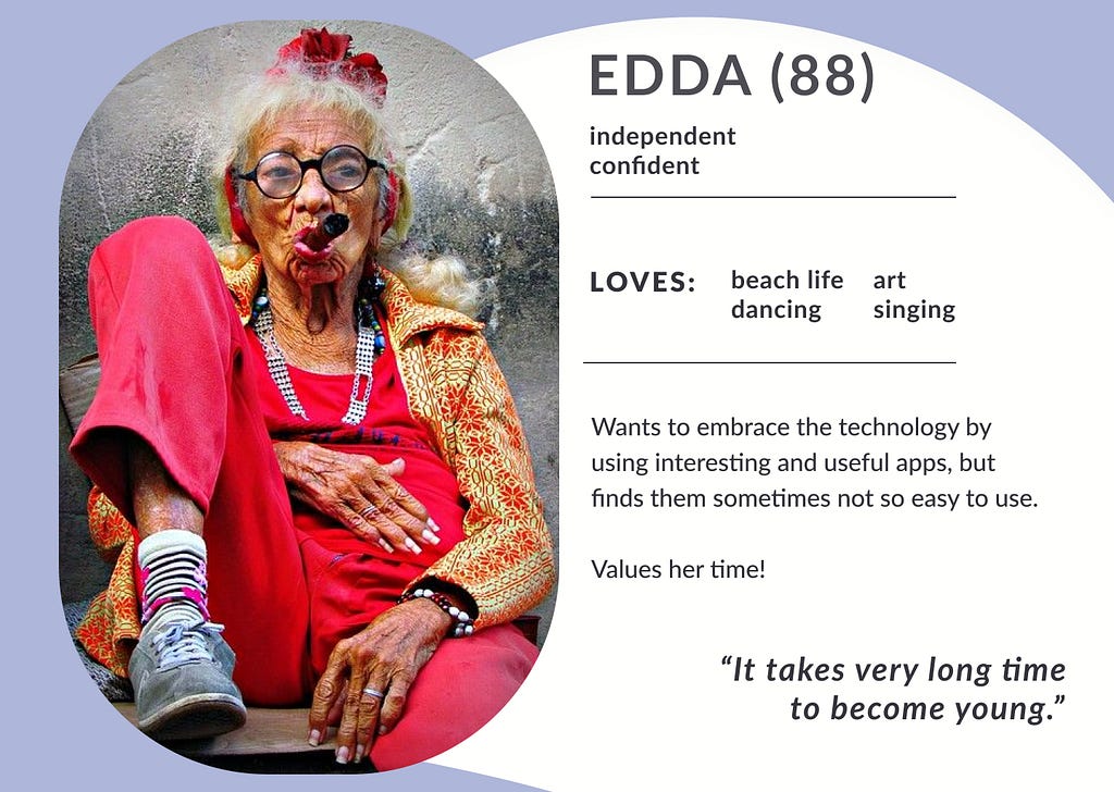
From our desk research we could better shape a picture of our audience. As it came out that they are active, curious, vivid and way ahead from a classical stereotype picture of seniors. Meet Edda!
Competitive Analysis and Mood Board
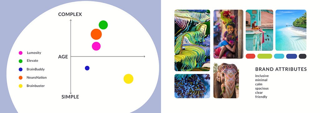
We took several applications that offer brain activity training or general tracking applications and could separate 4 main competitors to analyze.
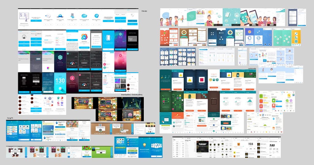
Conclusion — we positioned our brand, that we named after a small brain storming “Brain Buster,” orientated towards senior users inclusiveness and more simplicity. Based on brand attributes we conducted a survey with 3 different mood boards.
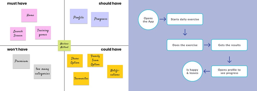
Moscow Method and User Flow
As everything was set we could move to the next step and check what we must/should/could/won’t have in the app and how is gonna MVP user flow.
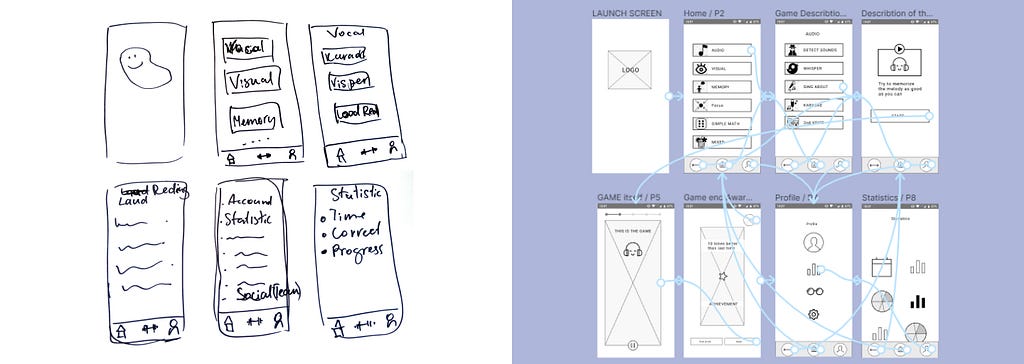
Low Fidelity Sketching and Mid Fidelity Prototyping
After a quick sketch of basic application screens came the stage where we design a mid fidelity prototype and tested it with users. All went well and we understood that for MVP we need to simplify our prototype and we are ready to go for high fidelity design and prototyping.
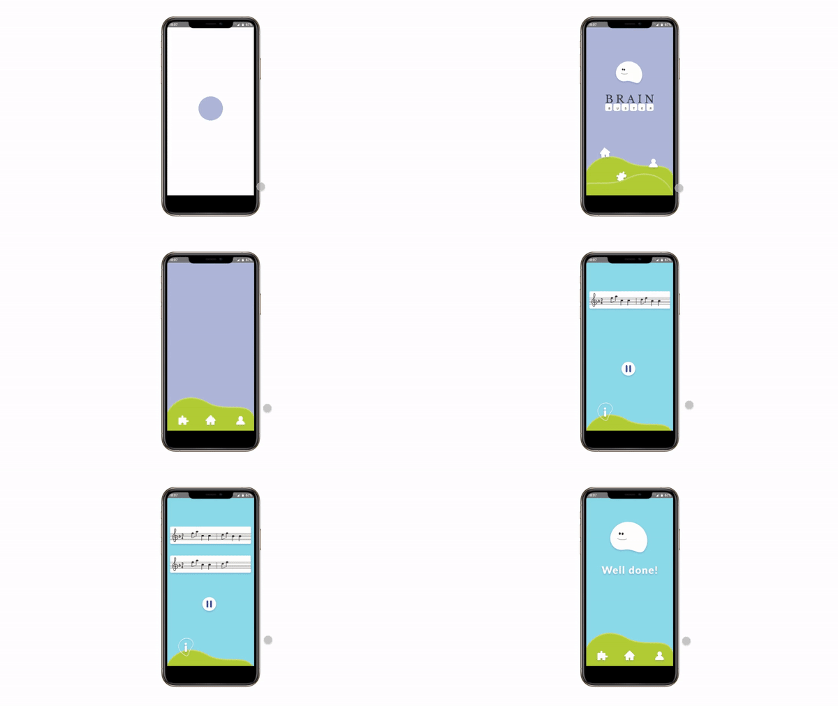
High Fidelity Prototype
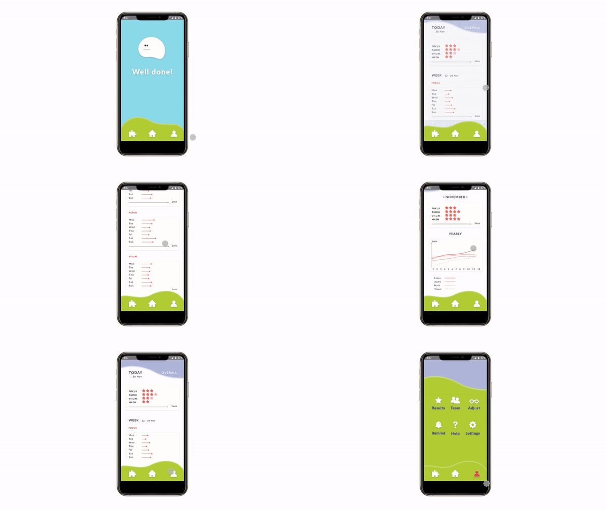
- Launch screen and game
2. Progress stats
Key Learnings
- Time management is the key with an exact schedule for how many days each phase we have.
- Mid fidelity prototype testing shows that we tend to overthink and sometimes a simpler way is better for understanding the solution.
- Keeping in mind that it should be senior inclusive, checking for it UI part and over checking it again all the time is crucial, because it’s very easy to slip away.
Don’t forget to give us your 👏 !

Case study: Tracking App was originally published in Chatbots Life on Medium, where people are continuing the conversation by highlighting and responding to this story.